Current Focus: Content Creation for Hao Ru Restaurant
An ongoing role focused on creating engaging content for Haoru's digital presence.
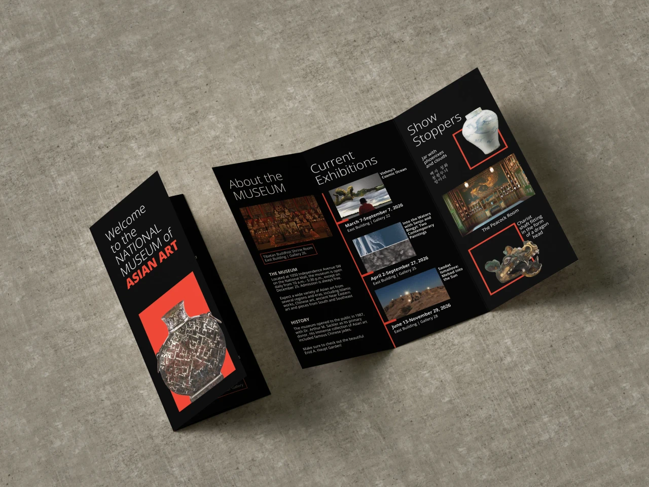
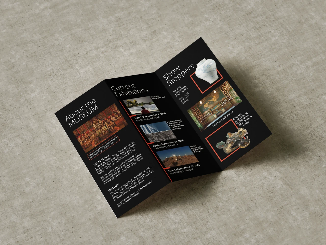
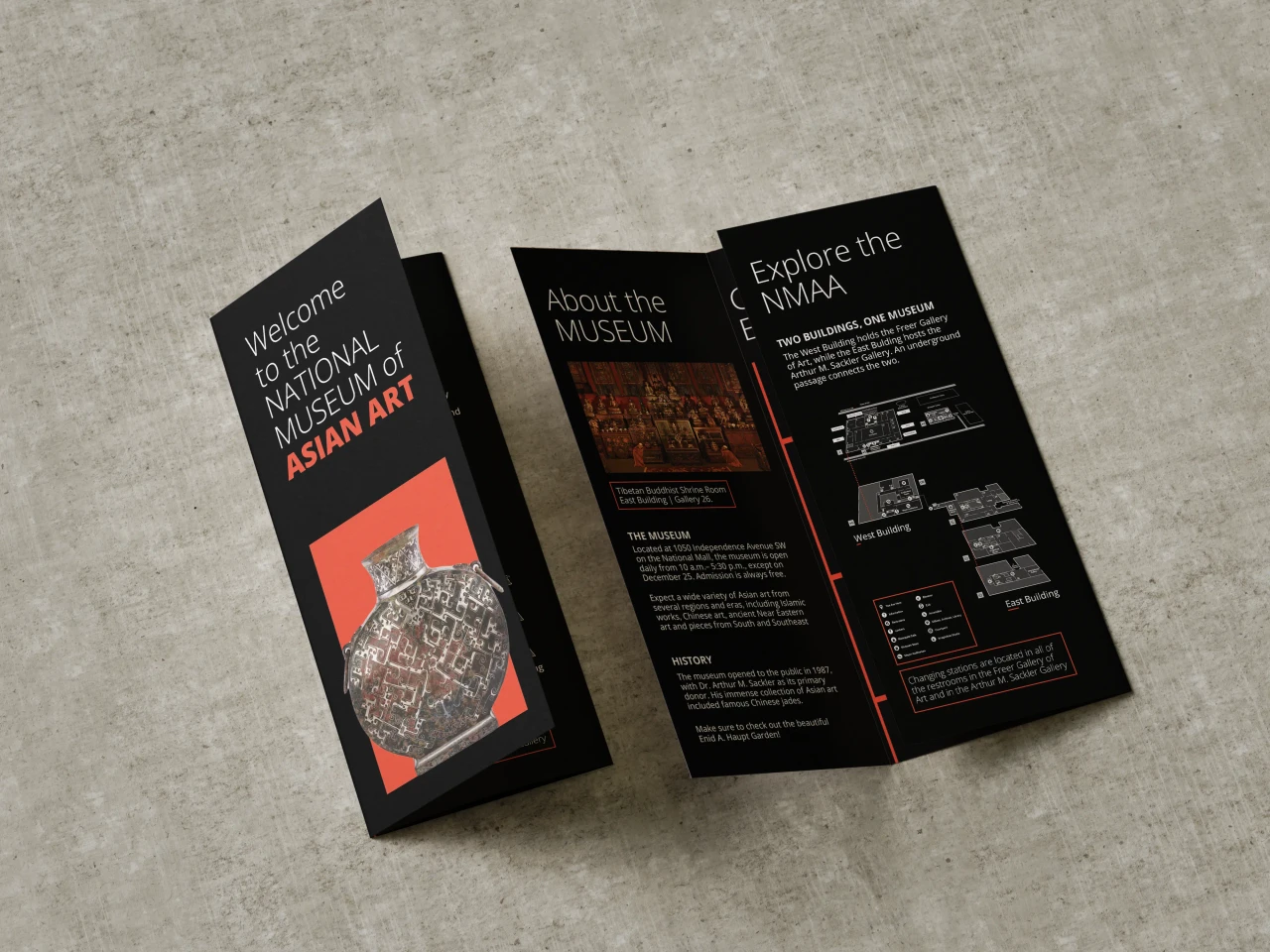
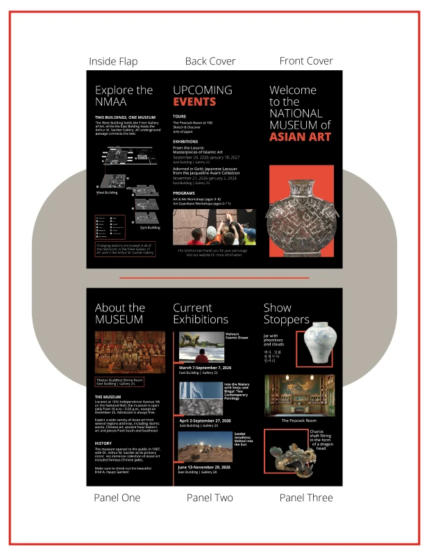
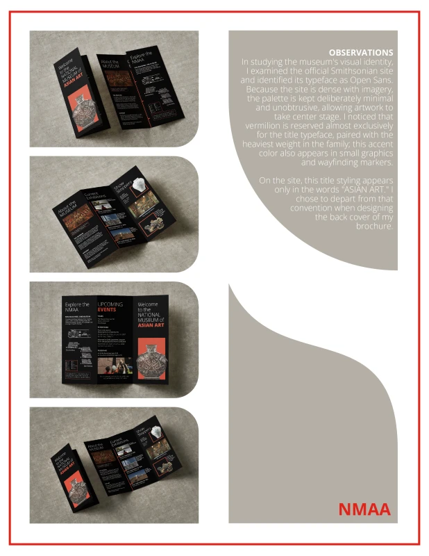
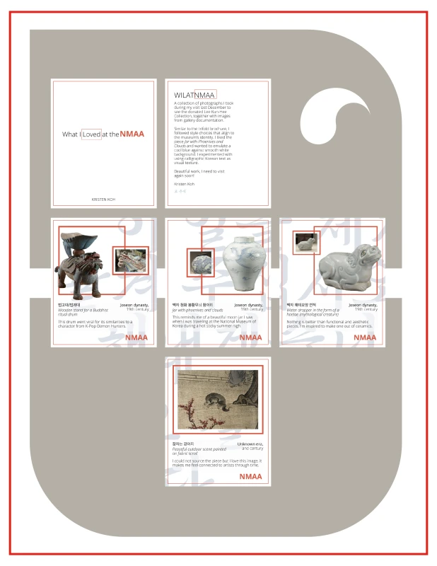
Design Challenge, referencing the National Museum of Asian Art
My goal was to design a visual identity for the museum's ongoing exhibitions, trying to make paper matter that fit as naturally as possible while putting in a personal touch. Using Adobe InDesign and Illustrator, I created special exhibit cards as well as a brochure that followed their current brand system that could be used to aid visitors of the museum. As someone who loves visiting the NMAA, I was excited to showcase the museum's cultural artifacts while adding my own favorite elements. Within these pages, I made sure to describe the reasoning behind my design choices and the process I went through to create them.
Lead Front-End Web Developer for OSC
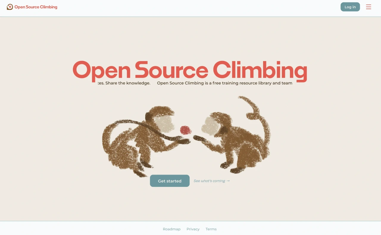
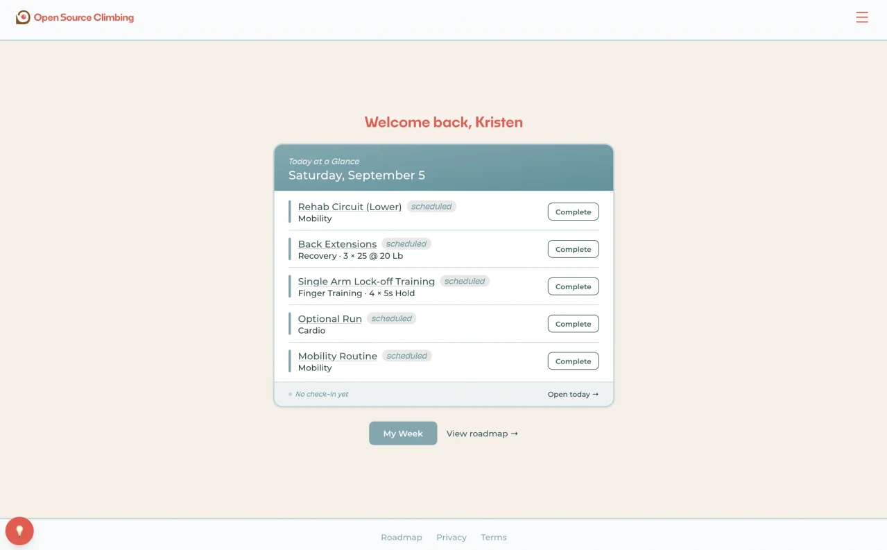
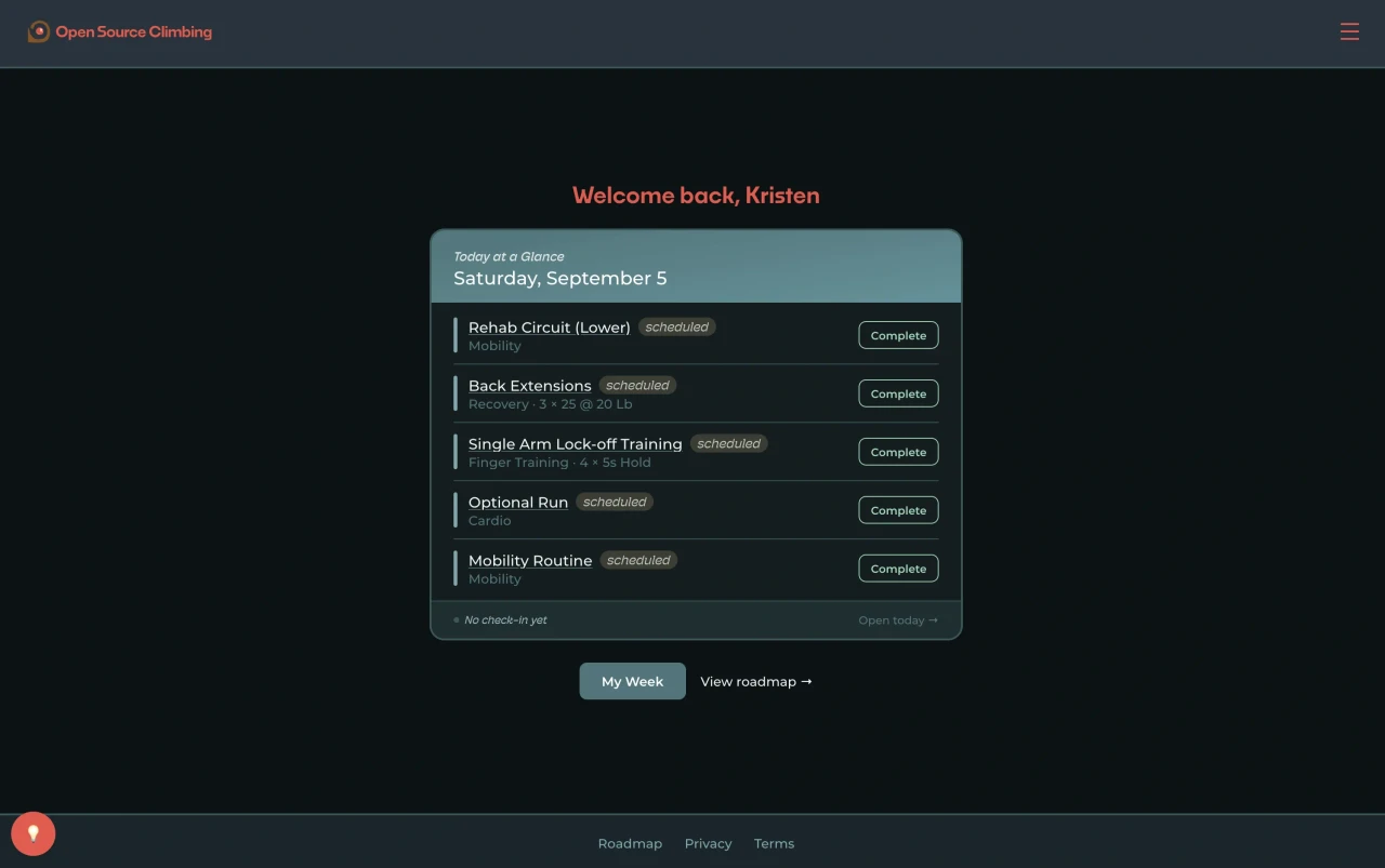
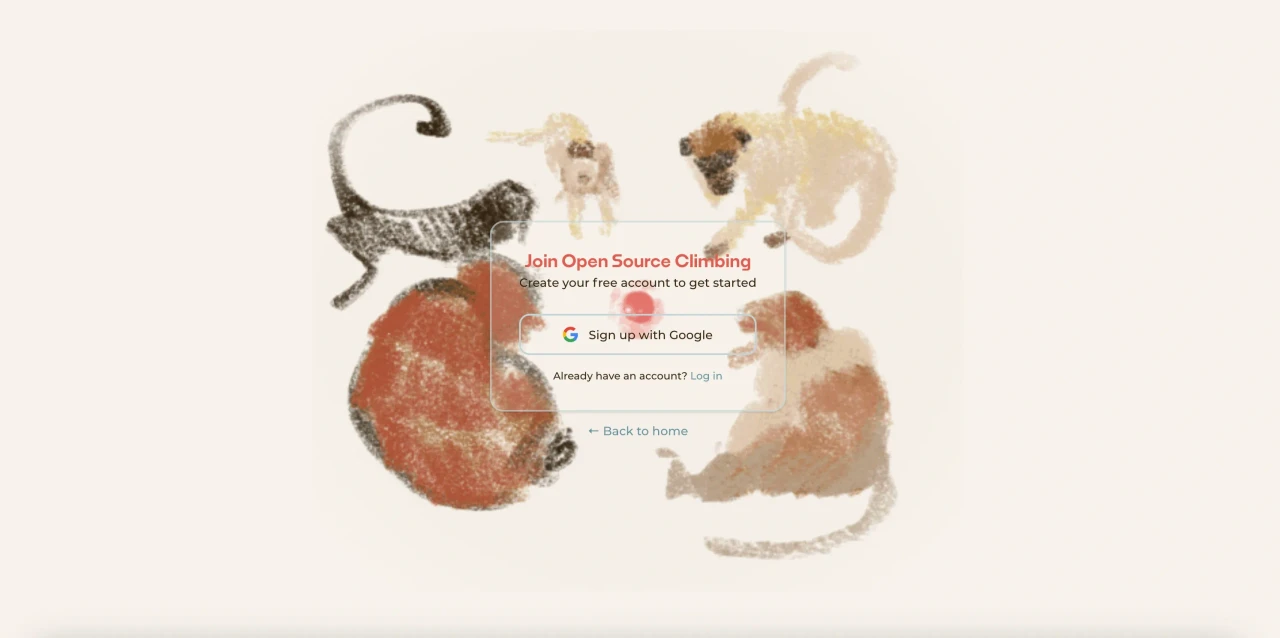
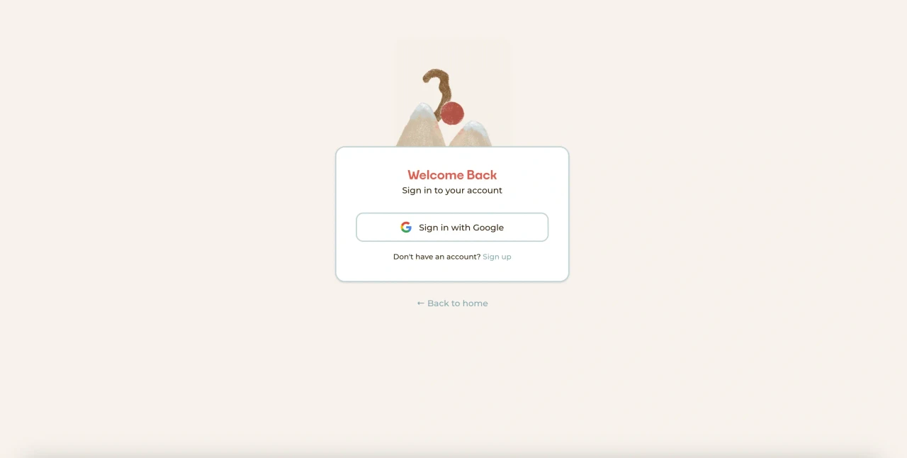
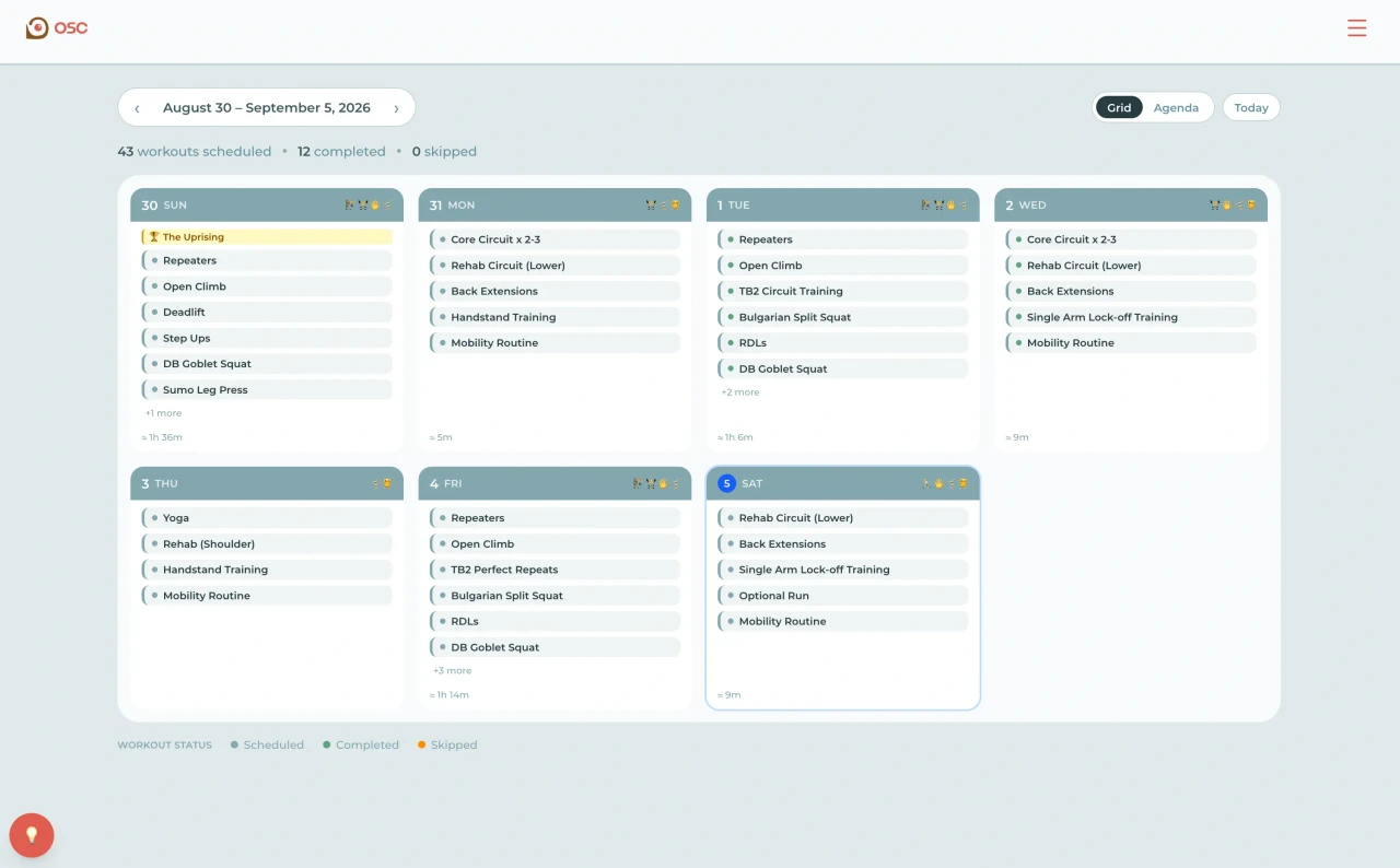
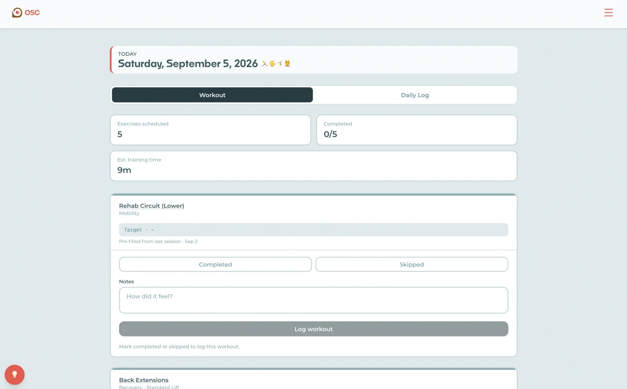
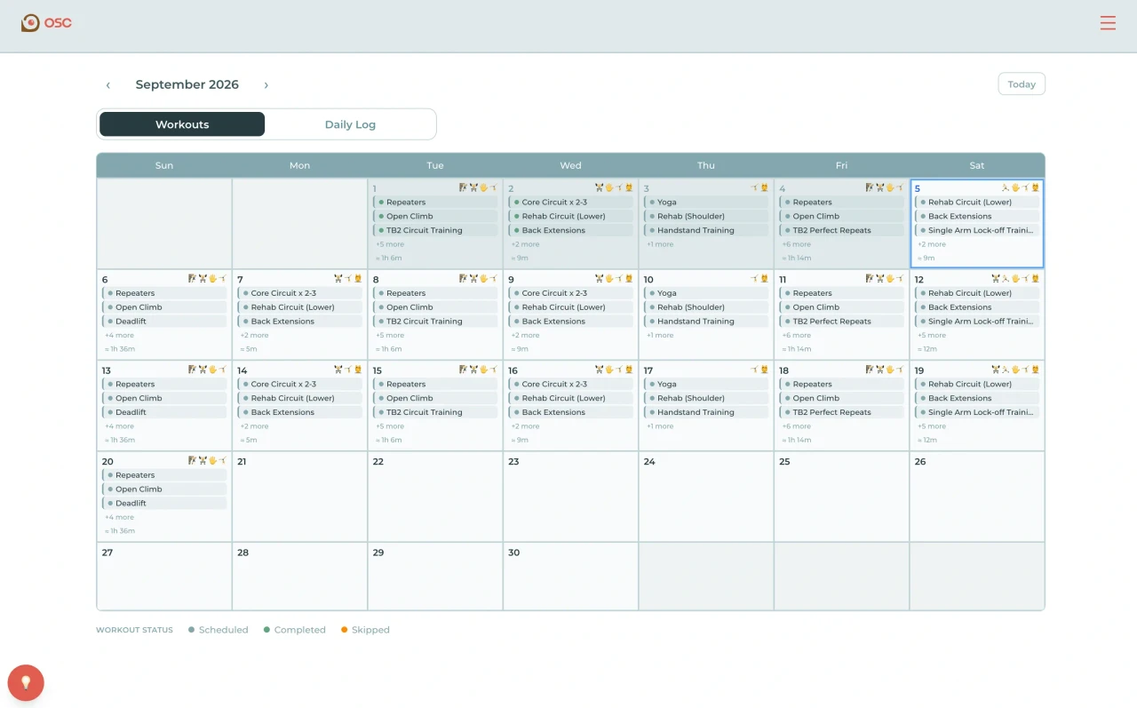
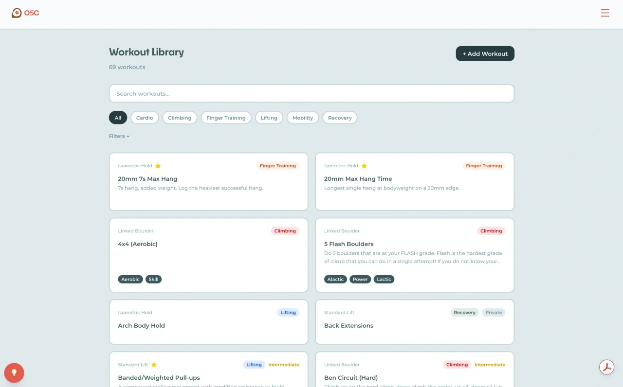
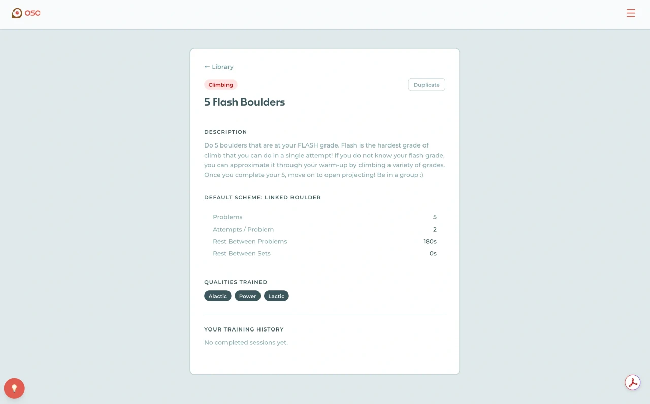
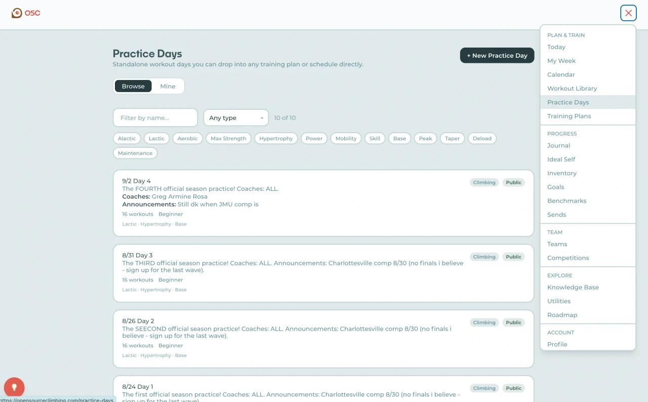
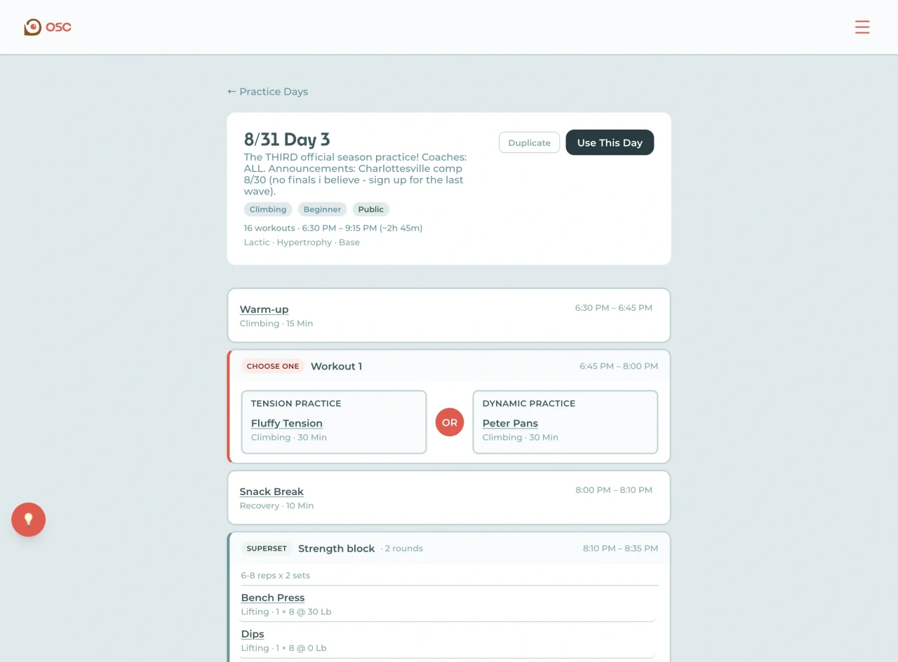
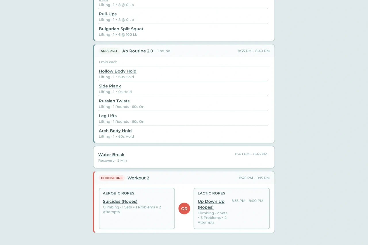
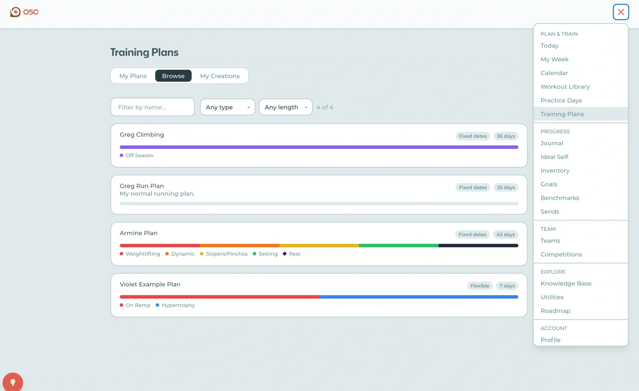
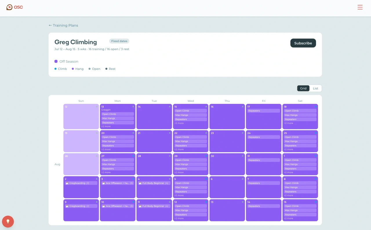
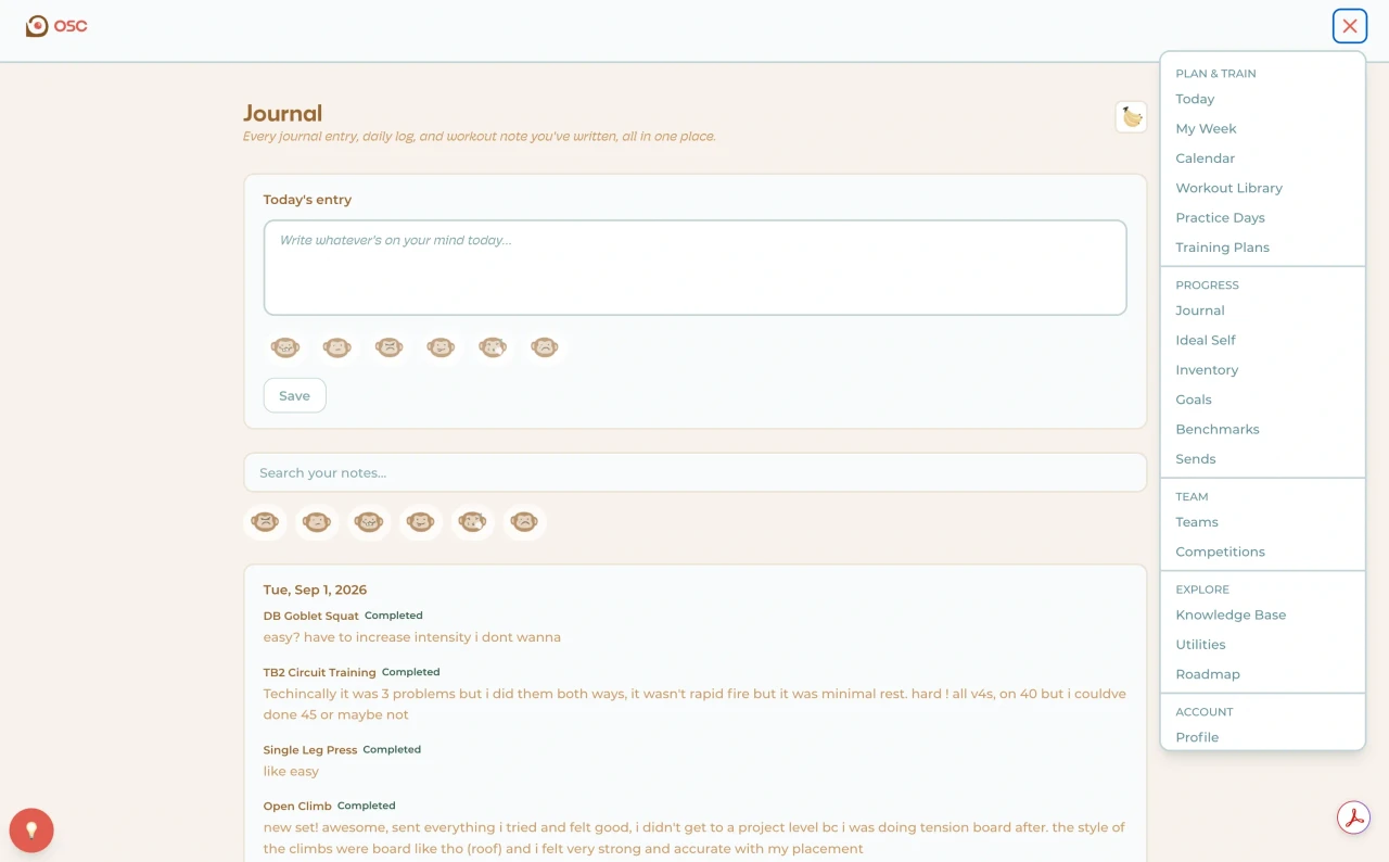
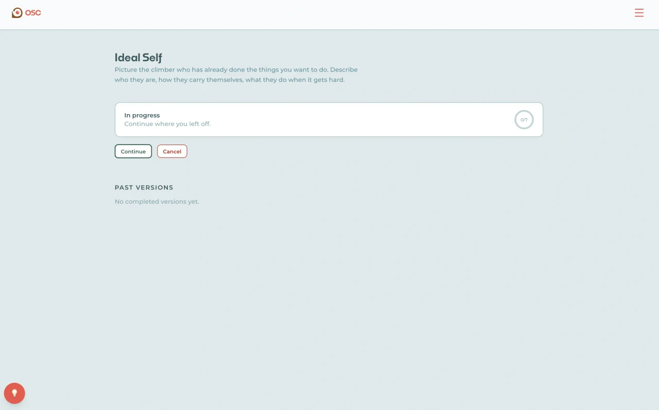
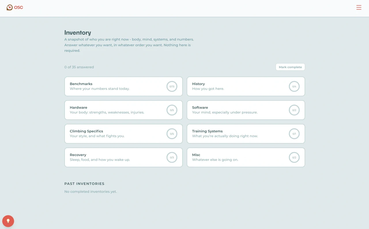
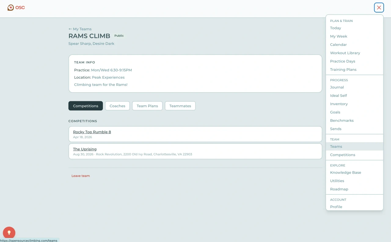
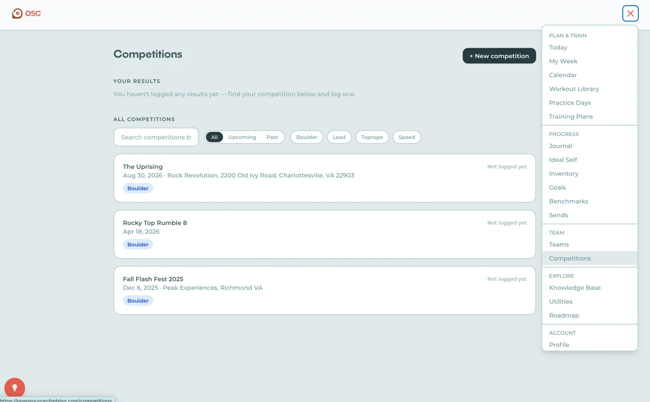
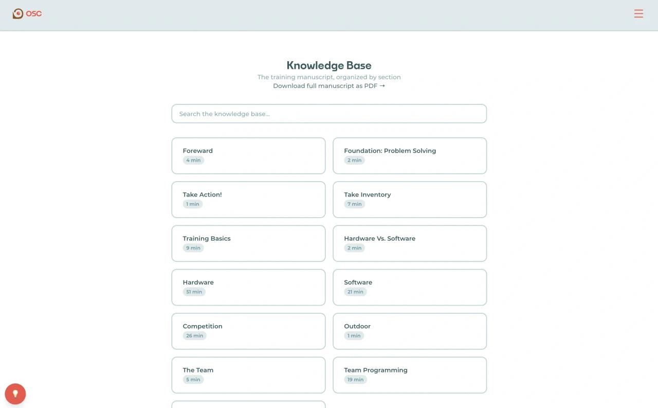
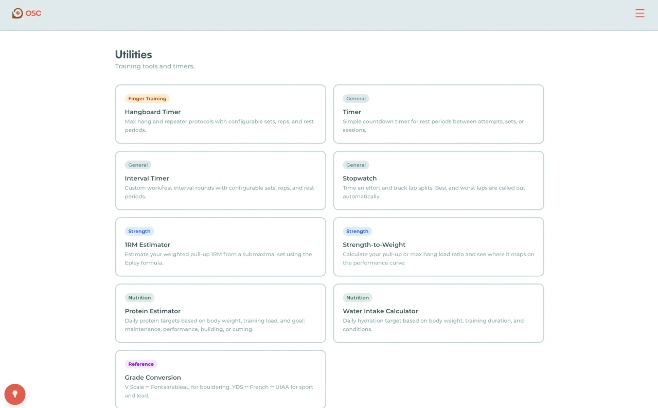
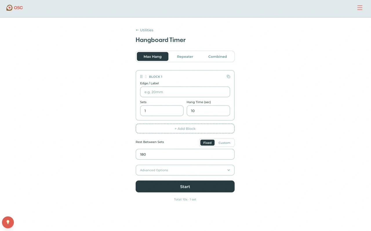
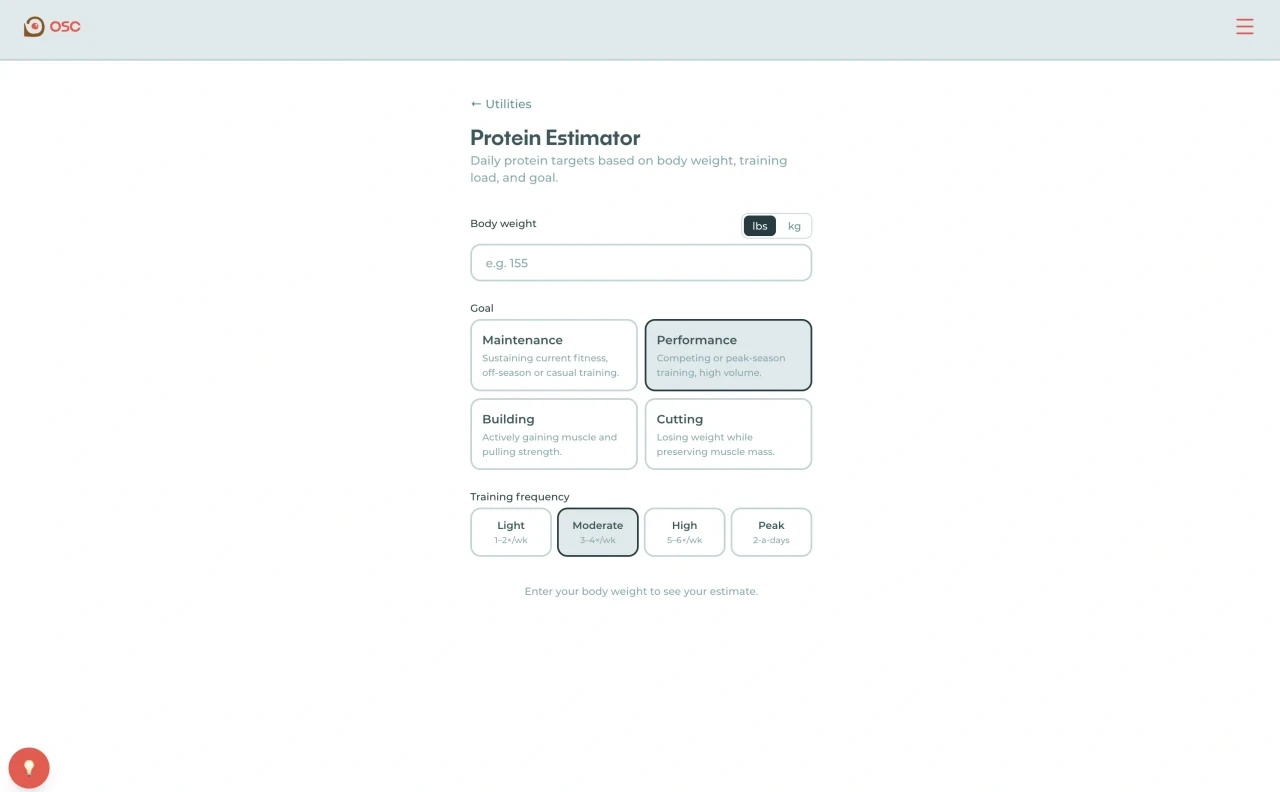
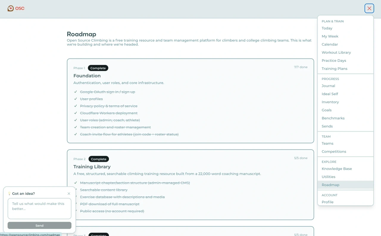
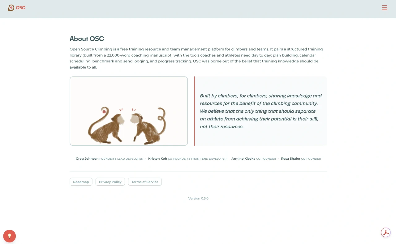
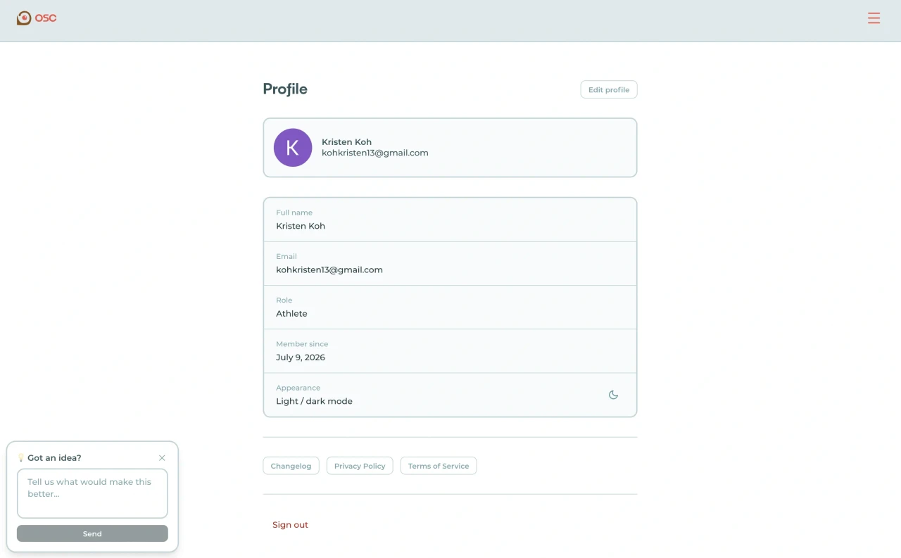
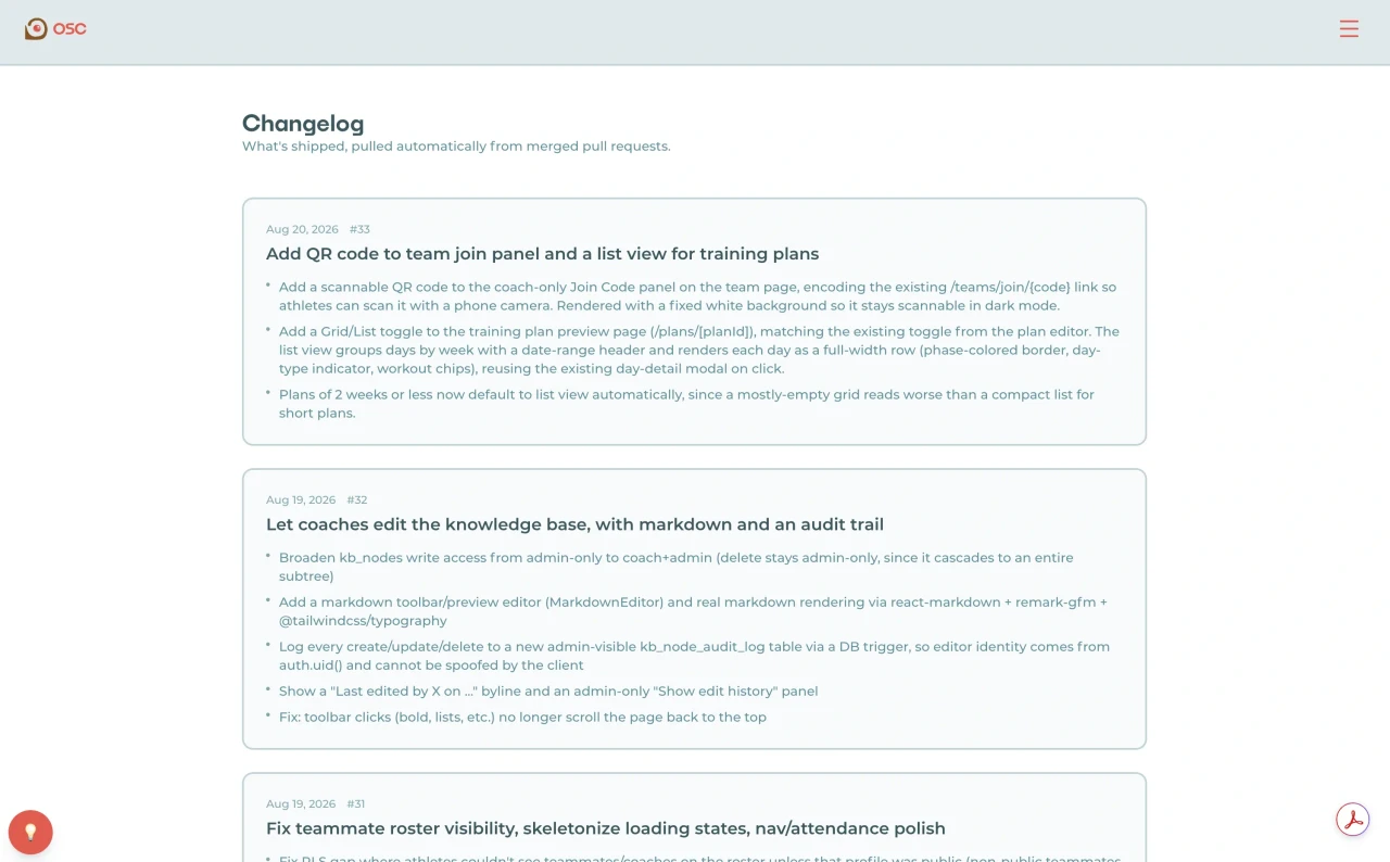
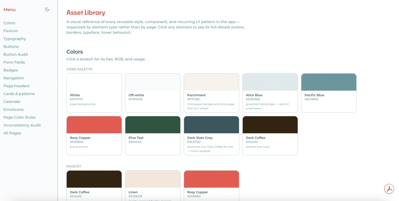
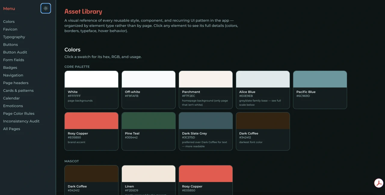
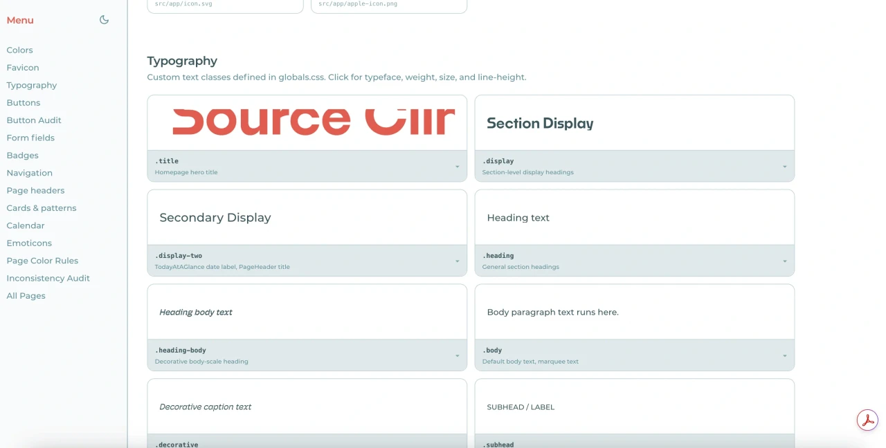
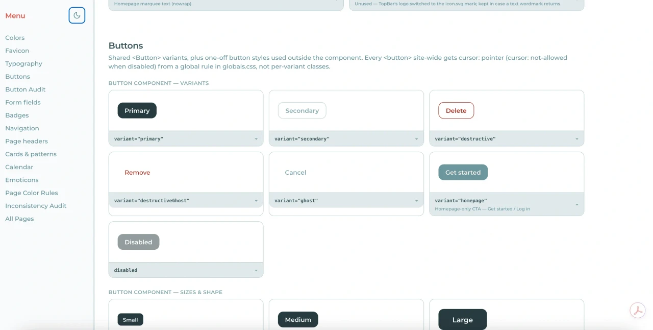
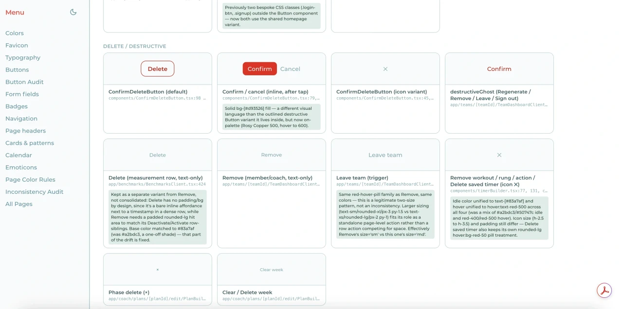
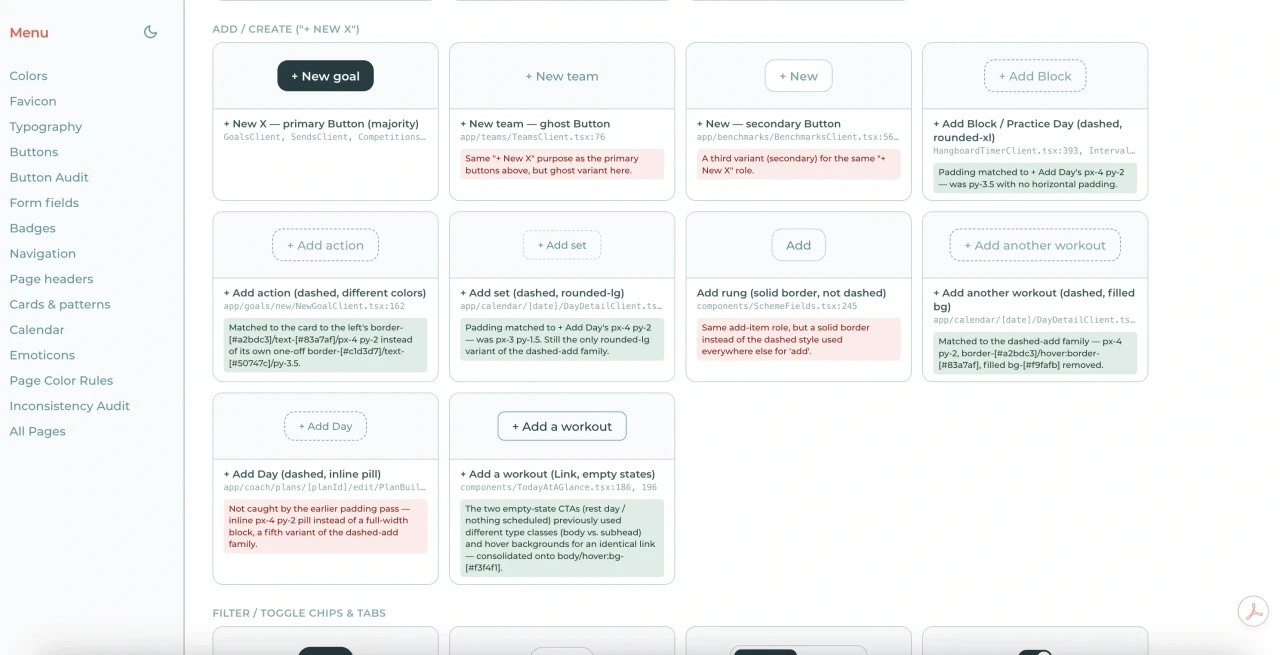
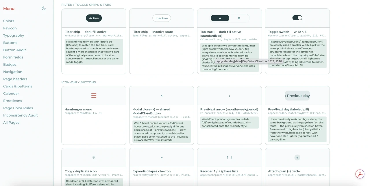
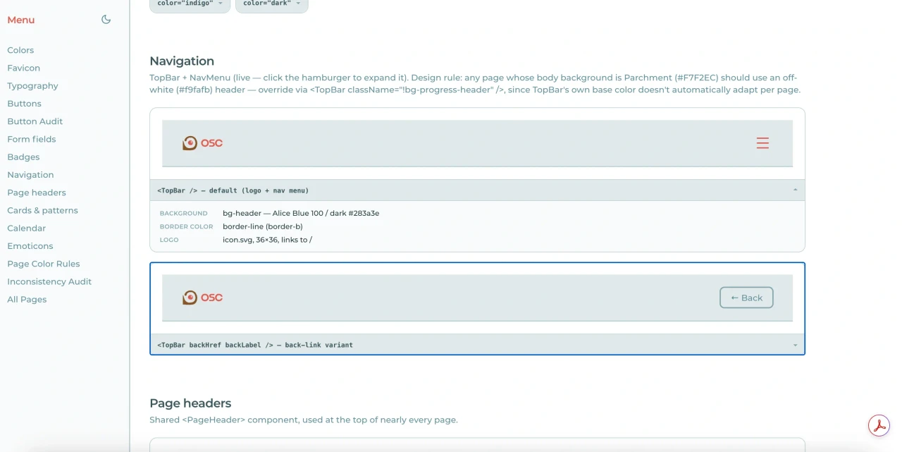
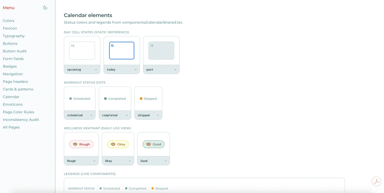
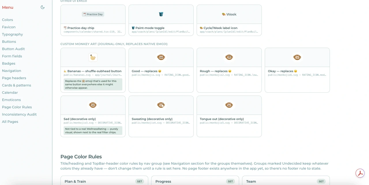
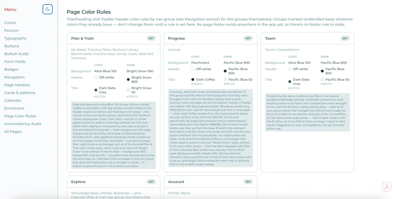
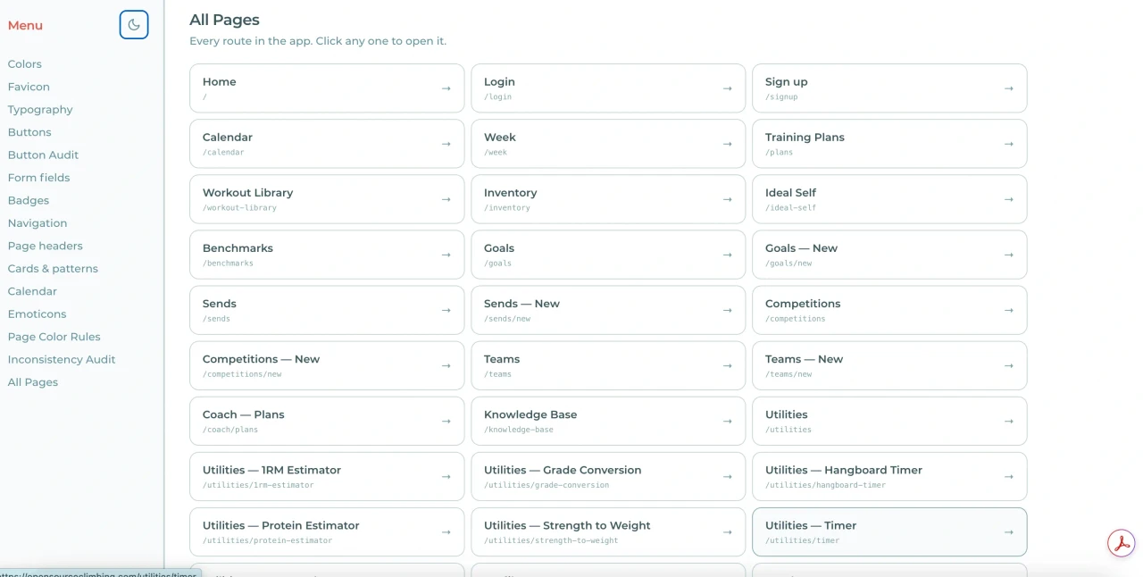
Open Source Climbing (OSC) is a free training resource app built for college climbing teams. I designed and built a complete visual asset library for the platform, including a color palette, logo, custom emoji set, buttons, and input components, along with a site-wide dark mode toggle for accessibility. The site's functioning dark mode and light mode version automatically aligns with each user's set preferences. These image previews almost entirely comprise of light mode, as that was how the site was most popularly viewed.
I worked closely with the back-end team, editing within a branch and pulling changes to ensure a clean work environment. We held online meetings regularly to discuss deadlines and create timelines to meet project goals consistently. The site was built with HTML, CSS, and JavaScript, and gave me hands-on experience picking up React along the way. The project launched live at opensourceclimbing.com.
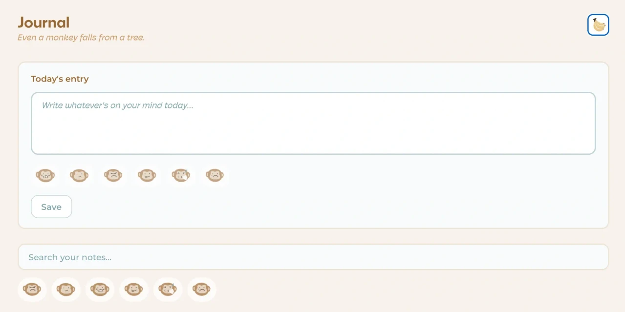
Built for climbing teams, OSC is specifically designed to enhance the climber's experience with optimized training, interactive features, and engaging content. The monkey motif left easter eggs throughout, one small favorite detail of mine was the motivational monkey quotes on the journal page, a playful touch for user engagement. Hand drawn illustrations and animations were used to create a unique visual identity for the platform, over 30 hours of design and development time on animation alone was spent. The site was designed with a visually minimal approach in order to let the functions of the site be navigated easily.
Instruction at Studio Two Three
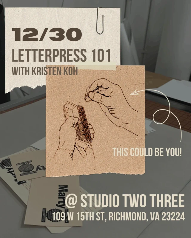
I taught multiple classes at Studio Two Three, "a 501c3 nonprofit community arts space that supports art making for personal & social change". My hope is to inspire others to try something new and explore the world of analog printing. In Letterpress 101 I covered type nomenclature, composing type, and press operation. The studio's traditional print shop houses several vintage presses donated by museums and private collectors. Letterpress workshops would begin with a guided tour of the studio's extensive century old wood and metal type collection, one that I've personally cleaned and catalogued. These classes typically ran in groups of three to five, though I also taught one-on-one sessions.
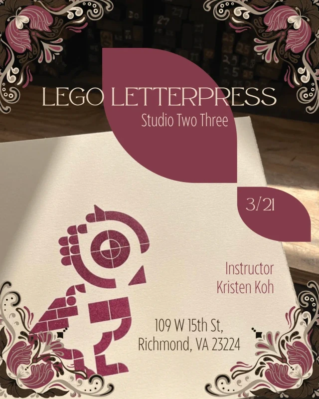
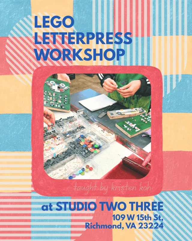
Lego Letterpress was a more approachable class that offered a low pressure introduction to analog printing using flat LEGO pieces.
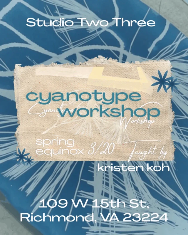
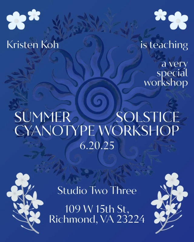
My Cyanotype instruction explored printing with natural materials, photographic images from film or transparencies, or truly unique items like a glass fish bottle. Workshops would sometimes be indoors depending on weather, if conditions weren't optimal for natural UV sunlight exposure, the studio's indoor exposure unit would save the day. These classes could be up to fifteen students. I was drawn to working with natural materials within artistic practice and recently I've experimented with chlorotype printing and hope to explore it further.

Branding Samples
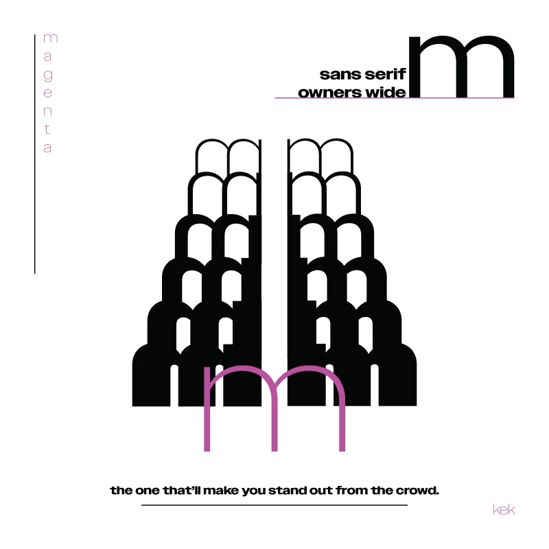
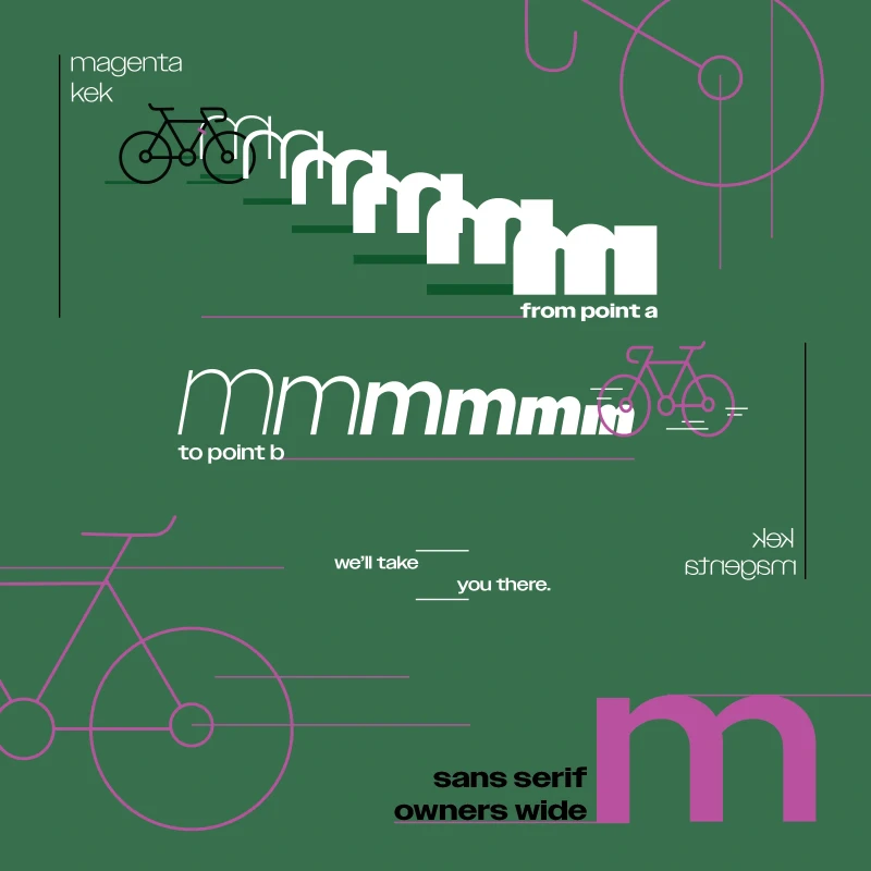
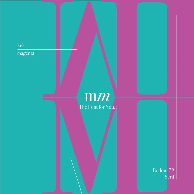
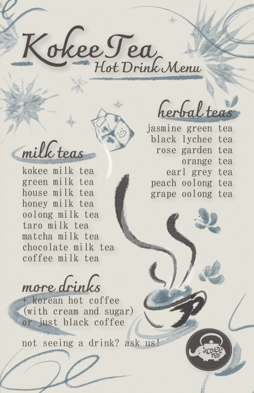
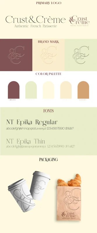
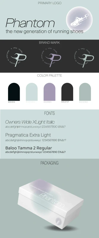
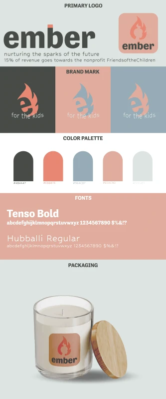
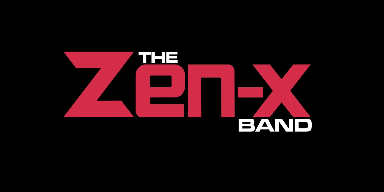
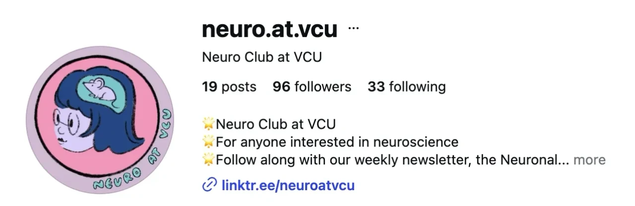
This is a collection of freelance and passion project branding work. It includes logo design for the local band Zen-X, menu design for Kokee Tea, a tea shop I worked at, and an illustrated logo and brand identity for the Neuro at VCU Club. Each project begins with research into the client's voice and audience, identifying their vision. I love the challenge of unearthing a client's true wishes when sometimes they aren't even sure of what they want. I like to help them find their way through sketching concepts, exploring different typefaces, and testing color palettes before finally arriving at an identity that resonates with them.
Additional projects explored typeface identity and business vision boards, each focused on capturing the feel and message behind the hypothetical product or organization. Across this work, I focused on building identities that felt consistent in the little details. Keeping an eye out for inconsistencies so that each brand felt cohesive across everywhere it appeared.
Poster & Zine Archive
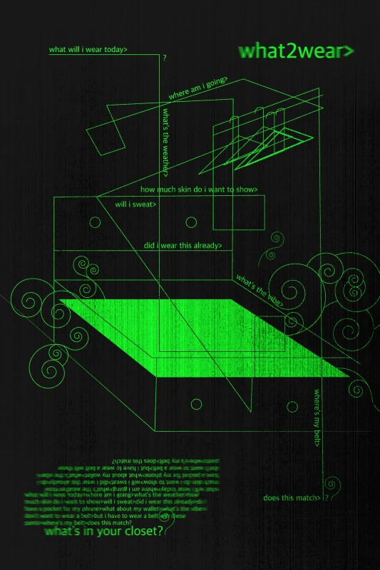
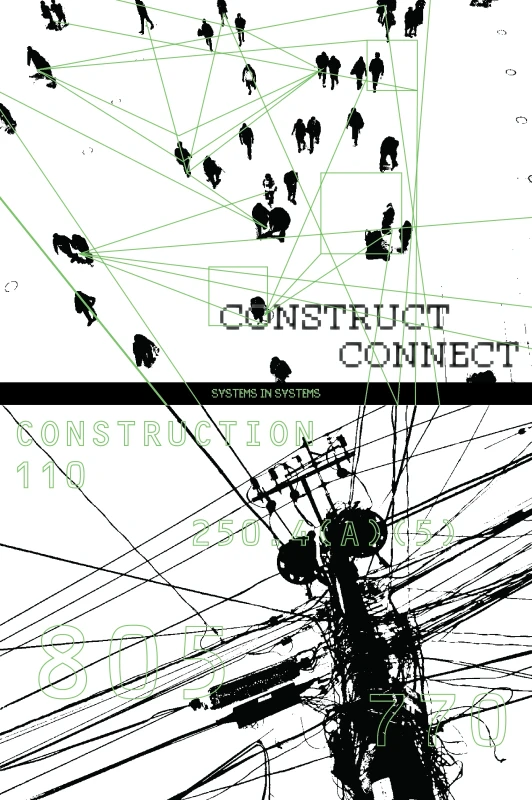
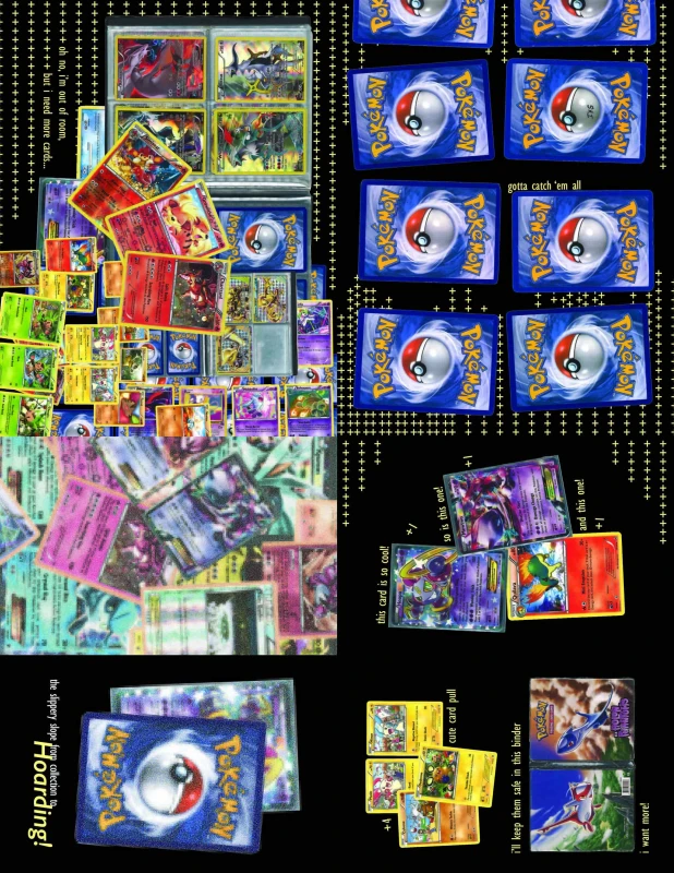
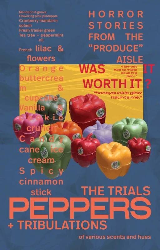
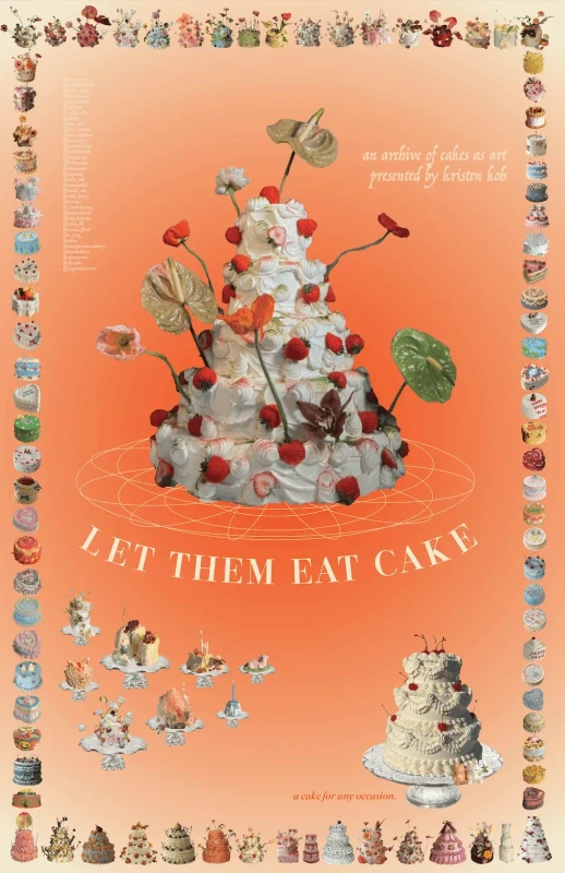
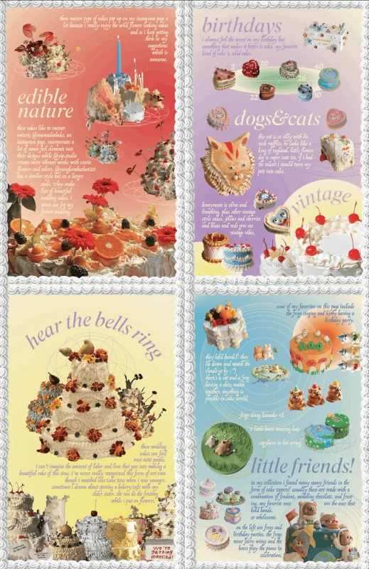
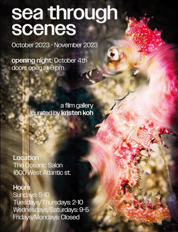
This archive gathered assorted posters and zines made over several years, following personal interests at the time or specific class assignments. Many of these posters were designed to live digitally, the first two videos here are moving posters. and that intent shaped their style and color choices. Some included moving elements and were built with simple animation in mind. These pieces were created in artistic spaces that valued controlled chaos and creativity over strict polish.
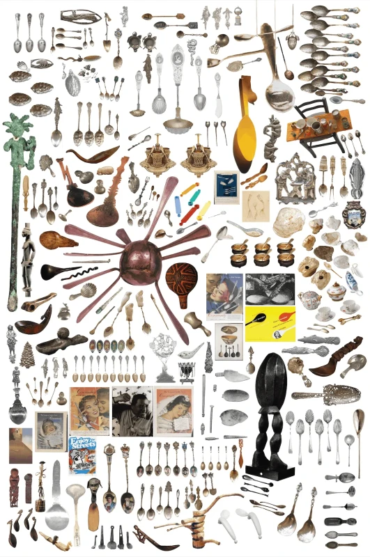
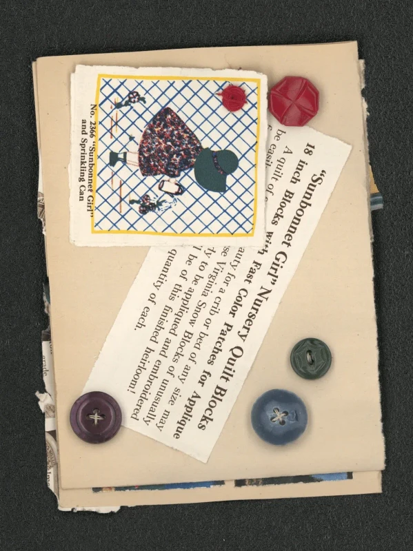
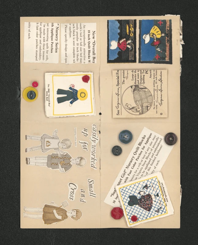
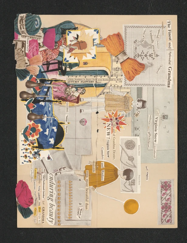
Working across posters and zines let me experiment freely with layout, type, and color in ways that felt looser than client based work. Some pieces leaned into collage and found imagery, while others were built entirely from original illustration and hand lettering. The collage piece on slide nine is made entirely out of thrifted scrap material from well known source SCRAP RVA. The dates on some of these old magazines were from nearly a hundred years ago. I love to work with existing material and rework pieces. Though I keep skills and lessons I've learned from past projects in mind, I like to start each project anew and try to figure out a different way to express myself creatively.
Last Published Changes: 9.29.2026
Contact me if you have any questions or would like to collaborate!
Contact | 703-403-2901 | Work@kohlio.studio